://> Concept Ideation | Style Guidance
Industry
Wellness, Coaching
Deliverables
Brand identity, Logo Concept. Color Palette, Typography Guidelines
THE CHALLENGE
In a crowded wellness space, the challenge was to develop a brand identity that felt distinctive while remaining calm, grounded, and credible. Through our conversations, it became clear that the brand was rooted in ideas of feminine wisdom, serenity, trust, and connection to nature. This led us towards an earth-inspired visual language that could express both emotional warmth and mature stability.

COLOR PALETTE
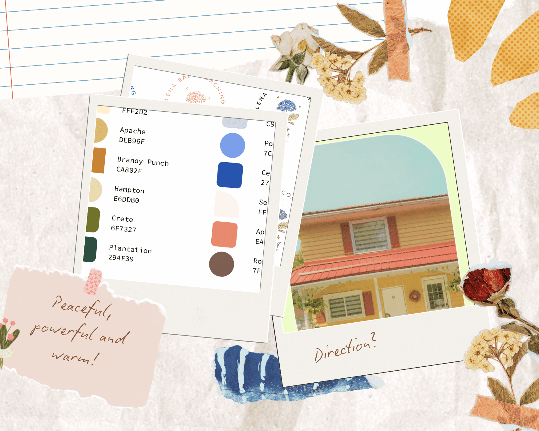
To reflect the client’s emphasis on femininity, wisdom, and serenity while avoiding pastel tones, we developed a palette grounded in warmth, versatility, and emotional balance. Seashell peach was established as the primary background colour for the logo, with wider application across Instagram posts, website sections, and other brand materials.
The palette was structured into four colour families,yellow, green, blue, and peach, each with light, saturated, and dark tonal variations. These tones were designed to be mixed and matched rather than used all at once, allowing for more balanced and complementary combinations. In practice, lighter shades support backgrounds, while darker tones are used for accents and text, helping the identity remain soft, grounded, and flexible across digital applications.
LOGO AND TYPOGRAPHY
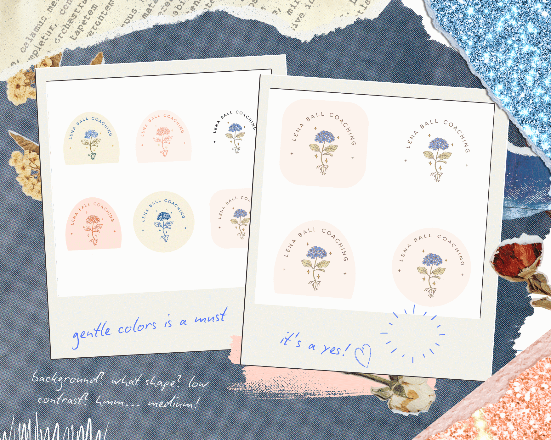
Nature is the central motif of the identity. Inspired by the idea of growth between heaven and earth, the hydrangea was chosen as the defining symbol, both for its meaning and for how naturally its form complemented the circular logo structure. Rendered in delicate line art, the flower expressed nurture, while the visible roots suggested growth through both aspiration and introspection.
The typography was selected to balance professionalism with softness. A thin, rounded sans serif brought a sense of calm, delicacy, and modern clarity, supporting the brand’s intention to feel both trustworthy and comforting.