BUSY BUT THRIVING

BUSY BUT THRIVING

://> Print design | Journal Design

Industry

E-Commerce, Print

Deliverables

Cover Designs, Spread Designs, Page Content, Body Copy

Busy But Thriving is a personal project developed as a 90-day “glow-up” journal designed to capture the experience of blooming through youth via self-care and personal affirmations while navigating an ambitious yet joy-filled life.

THE CHALLENGE

When developing the idea of a self improvement journal, we looked to spring as the project’s emotional and visual foundation — a season in which life begins to return after winter, and softness carries its own quiet momentum.


From there, the journal was shaped around the idea of blooming: not as a final state, but as an unfolding. This became the conceptual centre of the book, influencing both the tone of the writing and the visual direction of the design. The result was a journal intended to feel uplifting without becoming overly prescriptive or structured. Importance was placed on maintaining warmth and enjoyment.

CONTENT DESIGN

The interior was designed to support both reflection and routine. Rather than creating pages that felt rigid or overly optimized, the aim was to offer a framework that could hold different forms of expression: writing, doodling, sticker placement, small check-ins, and moments of pause.


The introductory spread was treated as an invitation rather than instruction. It guides the reader into the journal’s mindset, reinforcing the idea that growth does not arrive through perfection, but through participation.

COVER SYSTEM

The cover direction drew directly from the project’s central metaphor. Floral motifs were introduced as a visual expression of emergence, softness, and growth, positioning the book for a teen and young adult audience.


The cover was developed in an assortment of colours, suggesting the passage of time. The different colourways subtly reflecting the four quarters of the year. The effect was both practical and symbolic: a journal that could feel personal in selection, yet still belong to a wider seasonal logic.
PAGE LOGIC

PAGE LOGIC

The left-hand side is designed as a simplified checkpoint area; a quieter framework for daily maintenance and self-observation.

Clear subheadings help to preserve the aesthetic while making each section feel light and approachable.


Decorative motifs like blue colored shapes, miniature circle decors and geometric shapes remind of fluidity, imperfection and carry unruliness that's meant to encourage exploration without strictness, reminding that growth is layered. Sections such as “End of Day Highlights” and “I want to ........ Tomorrow” create room for reflection and projection, holding the little wonders of the day alongside the hopes of tomorrow.

The right-hand side has more open space for writing and personal expression, shaped around the natural habits of right-handed users and their tendency to write diaries from this side first. This makes the page feel more intuitive and generous.


Leaving half a page for writing and half for artistic expression was intentional. There is enough space to encourage writing, but not so much that it feels barren or overwhelming to fill. Additional space is provided for drawing, pasting pictures, or even more writing, if desired. There are no rules, only suggestions.

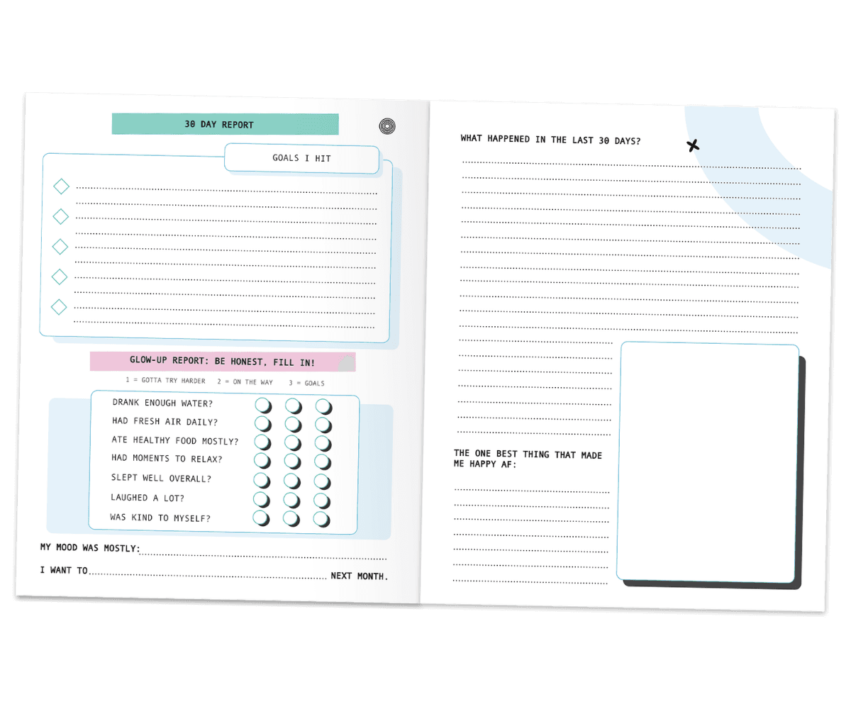
To carry forward the themes of nature and glowing up, small acts of self-care were given dedicated space on daily pages and the 3 dedicated “30-day Report” pages. These cover themes like sleep, hydration, nutrition, and positivity. They are treated not as performance metrics, but as reminders that growth is often built through small, repeated gestures of care.

The left-hand side is designed as a simplified checkpoint area; a quieter framework for daily maintenance and self-observation.

Clear subheadings help to preserve the aesthetic while making each section feel light and approachable.


Decorative motifs like blue colored shapes, miniature circle decors and geometric shapes remind of fluidity, imperfection and carry unruliness that’s meant to encourage exploration without strictness, reminding that growth is layered. Sections such as “End of Day Highlights” and “I want to …….. Tomorrow” create room for reflection and projection, holding the little wonders of the day alongside the hopes of tomorrow.

The right-hand side has more open space for writing and personal expression, shaped around the natural habits of right-handed users and their tendency to write diaries from this side first. This makes the page feel more intuitive and generous.


Leaving half a page for writing and half for artistic expression was intentional. There is enough space to encourage writing, but not so much that it feels barren or overwhelming to fill. Additional space is provided for drawing, pasting pictures, or even more writing, if desired. There are no rules, only suggestions.

To carry forward the themes of nature and glowing up, small acts of self-care were given dedicated space on daily pages and the 3 dedicated “30-day Report” pages. These cover themes like sleep, hydration, nutrition, and positivity. They are treated not as performance metrics, but as reminders that growth is often built through small, repeated gestures of care.

TYPOGRAPHY

Marker-style typography was selected for the title, imparting a sense of comfort and approachability to the cover. Its organic nature softens the overall appearance, creating a more personal touch and reducing rigidity. The graphic floral design letters enhance the playful aesthetic, providing visual contrast between the bold and delicate characters on the cover.


For the remainder of the journal, typography was approached with clarity and familiarity in mind. A classic typewriter font was utilized for the interior, ensuring that the pages evoke nostalgia while remaining easy to read.

OUTCOME

The result is a light-hearted, easy-going journal with thoughtful page arrangements, inviting stressless participation. The option to choose different color covers adds more to the experience of discovery and curiosity for the buyer. For people who love to collect beautiful books, this collection will also look aesthetically wonderful on the shelf!